1 month ago
9
1 month ago
9

Chris WrightJul 1, 2025, 09:00 AM
With the summer's tournaments rolling on and transfer rumors abound, it might feel like the new Premier League season is a long way off. But it's never too early to find out who will be wearing what when the 2025-26 campaign begins.
England's top 20 teams will not renew hostilities until mid-August, but several of the country's biggest clubs have already unveiled the jerseys they will be wearing next season, including Arsenal, Manchester United and Tottenham Hotspur. A couple of teams -- Chelsea and Manchester City -- have even been playing in theirs at the FIFA Club World Cup.
We have seen design inspiration from stadiums to local shopping malls, and Victorian civic infrastructure to the major waterways of Great Britain.
So why should you have to wait until all of the Premier League kits are out before you get to see them ranked? We've kicked off our annual analysis below and will add each new home, away and third (even fourth, in some cases) jerseys as they are released. So keep coming back to see the latest new threads!
13. Tottenham Hotspur home (Nike)
Dreary stuff from Spurs, who have gone early with an uninspiring home jersey. Indeed, Spurs have developed a habit for cranking out banal home kits that are almost completely indiscernible from each other in recent years. Unfortunately, this is just the latest in a longline of mediocrity, and looks more like a training kit than one for gracing a home stadium.
12. Aston Villa away (Adidas)
Somewhat curiously, Villa's black-and-steel grey away shirt was conceptualized as a tribute to the Bullring shopping mall in central Birmingham. The fluid lines on the sleeves and hexagonal pattern on the torso are specifically intended to mimic the futuristic facade of the Selfridges building. Will it fly off the shelves outside of Villa's home city?
11. Brighton & Hove Albion home (Nike)
A high-fashion launch shoot cannot disguise the fact that, when it comes down to it, this is more of the same from the Seagulls. Rather than the standard yellow trim, this season's familiar blue-and-white stripes are accompanied by accents of minty turquoise like the rails that run along the city's seafront.
10. Chelsea away (Nike)
Chelsea will once again be playing in white on their travels, though the orange-and-blue trim of last season has been replaced. The more muted detailing in green and red is a visual reference to the club's 1974-75 away shirt, which they wore while being eliminated early from both the FA and League Cup, before getting themselves relegated from the old First Division for the first time in over 10 years. Treasured memories, we're sure.
9. Tottenham Hotspur away (Nike)
Released with the dramatic tagline "In darkness, we dare," the blackout design has a dark-grey grid pattern overlaid to add some texture. It's marginally more interesting than the home shirt, but that really isn't saying much.
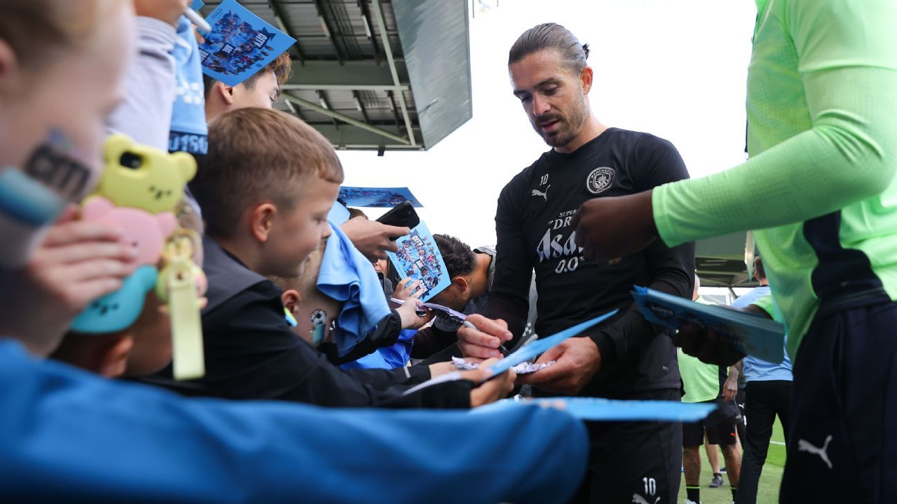
8. Manchester City home (Puma)
Man City fans love a kit with a sash, but it's rare for the club to go for one on their home kit. The sky-blue jersey features a wispy, cloud-like diagonal stripe that appears to be drifting across the front. Feels like an early draft design that never got fully refined, but if manager Pep Guardiola gets his team back to winning ways while wearing it then supporters won't care.
7. Wolverhampton Wanderers home (Sudu)
A sharp kit that also features a mini history lesson in the form of the pattern that is debossed into the fabric of the jersey. It is inspired by the ornamental decorations and old-time amusements of the Molineux Pleasure Grounds -- the Victorian public park that formerly occupied the site of their Molineux stadium.
6. Chelsea home (Nike)
Less gaudy than last season's "blue flame" design, Chelsea have toned things down with a fairly bland blue kit that is designed as an homage to their own little corner of West London. The angular graphic was constructed from digital scans of local civic buildings, such as the pillared facade of the Chelsea Old Town Hall. It's fine, but not particularly exciting.
5. Manchester United home (Adidas)
After struggling to their worst-ever Premier League finish last term, United are hoping that a fresh kit will bring a revival in fortunes This design is fairly traditional, with a solid red base and sparse black-and-white trim. However, the material does contain a subtle reference to Old Trafford via a smattering of dots and stripes, which are meant to reflect the shape of the pitch markings, dugouts and terraces at the Theatre of Dreams. It's a perfectly serviceable home kit, but is not destined to be memorable.
4. Arsenal home (Adidas)
The Gunners have the standard red-with-white-sleeves arrangement with the only notable adornment being the club's old gothic-style "A" symbol worked into a pattern in the fabric. The "A" first appeared on Arsenal's old "Victoria Concordia Crescit" crest in the late 1940s and provides a classy nod to the club's heritage on a clean, contemporary kit.
3. Newcastle United home (Adidas)
Newcastle's iconic black-and-white stripes are elevated by the burred edges of the bars (described by the club as "shepherd's check") and the vibrant blue trim. On the back of the neck, the addition of the motto "Howay the Lads" is just an extra element that makes this jersey unmistakably Newcastle.
2. Everton home (Castore)
With a new Hill Dickinson stadium to christen next season, Everton have produced a companion kit directly inspired by the 52,000-seater ground. Somewhat unusually for the Toffees, their royal blue home shirt will feature a distinct all-over pattern in the form of waves, which represents the River Mersey that flows directly beside their new waterfront home. A simple and effective design that has meaning -- something we need to see more of when it comes to kits.
1. Newcastle United third (Adidas)
Triggering the nostalgia pangs among fans of a certain age, this is a modern take on the club's dark blue, green and gold away kit of 1997-98, which has become a cult classic. The contemporary revamp lacks some of the unique detail of the original (such as the off-centre striping and the gigantic seahorse graphic) but the color palette still looks great and that retro trefoil logo adds a touch of panache.