Chris Wright, Toe Poke writerAug 6, 2024, 09:00 AM
After a summer brimming with international action, club football is set to return this month, with the 2024-25 Premier League season kicking off on Aug. 16.
As ever, clubs in England's top flight have been whetting their fans' appetites by releasing a slate of new kits for the upcoming campaign with inspiration drawn from a bewildering array of sources including ancient African art, birds of prey, inland waterways and molten metal.
While some away and third alternate kits are yet to be released, there are already plenty out there to pore over, as all 20 clubs have released at least one of their uniforms so far.
Here we rank each Premier League club's 2024-25 kits with their outfield home, away and third designs taken into consideration as one collective entry. Each club's combined output has then been ranked from 20-1.
But, with several kits still to be unveiled over the coming days, that order could change. So keep checking back here to see the latest kits added as they are released, and see how they impact the ranking.
20. Wolverhampton Wanderers (Sudu)
Home: Despite a change in supplier, Wolves will essentially play in much the same home kit as last season with Sudu (a new sportswear brand backed by Fosun, the Chinese conglomerate who also own the club) basically removing the white flecks from the collar and cuff trim and being done with it. You'd think enrolling an in-house supplier might open the floor to something a little more imaginative, but instead they are foisted with what we feel is a dreary downgrade.
Away: Wolves' shiny black away kit is marginally more rousing thanks to the gigantic line drawing of a baying wolf that juts in from the right-hand side of the torso. If House Stark had a football team plugging away in the Westeros Premier League (Northern Division), this is probably what they'd be wearing next season.
19. Southampton (Puma)
Home: Saints have returned to the top flight after a year away, but this kit is more non-league than Premier League. This bog-standard, simplistic take on Southampton's traditional red and white stripes is further let down by the gaudy logo of the club's new shirt sponsor.
Away: The unusual jazzy geometry of the away kit could easily have been a prematch warmup jersey. It looks tacky and plasticky, which is never usually a good thing when it comes to football shirts.
18. Everton (Castore)
Home: Castore replaces Hummel at the helm for Everton this season and it's clear just they have a tough act to follow. At least they make an attempt to break up the blue t-shirt with a pinstriped round-neck collar and a collage graphic (made up of fragments of the Toffees' original 1878 club crest) but it doesn't do enough to make it stand out.
Away: While presented by Castore as an homage to Goodison Park in what will be Everton's final season at their venerable old stadium, there isn't actually much that ties the black and yellow away kit to the club's home of over 130 years. An M.C Escher-style geometric pattern is also thrown into the mix, though what that has to do with the ground which became the club's home since 1892 is anybody's guess. Oh, and the modern, minimalistic version of Prince Rupert's Tower in place of the club crest feels like a needless innovation.
17. Brighton & Hove Albion (Nike)
Home: No prizes for guessing that Brighton will be playing in blue and white stripes at home again this season, but there are a couple of changes to note. First of all, the shoulders are predominantly white for the first time since 2017-18, the club's debut season in the Premier League. Secondly, there are fine gradient pinstripes within the blue vertical bands that add an extra bit of depth to the design.
Away: Sunshine yellow with narrow navy stripes, Brighton's new away kit is a nod to their 2013-14 shirt. Quite why the Seagulls would want to hark back to a season in which they finished sixth in the Championship before being dumped out of the playoffs at the semifinal stage by Derby County, leading to the immediate dismissal of coach Oscar Garcia, is anyone's guess.
17. Nottingham Forest (Adidas)
Home: When it comes to Forest's home shirts of recent years, not a lot seems to change and unfortunately that theme continues into 2024-25. Last season's ultra-plain design was excruciatingly dull, so at least it's slightly uplifting to note that the new jersey features a subtle jagged graphic made up of an overlapping image of the club's two European Cup winners' stars.
Away: Forest's away shirt is dark blue with a slanted, checkered pattern made up of lighter, blue-grey panels. The trim is then rendered in the very hottest of hot pinks to provide a wallop of stark contrast.
15. Fulham (Adidas)
Home: More of the same for Fulham, who will once again turn out in a crisp white home shirt finished off with a few accents of black and red trim. This season, the fabric has a tactile "waffle" weave that looks good up close.
Away: After dabbling in shades of blue and pink of late, the Cottagers have revisited their traditional away colours once again with a red and black striped shirt. It's one for the traditionalists, but nothing for anyone else to really get excited about.
14. Leicester City (Adidas)
Home: A standard blue template is all Leicester City fans can look forward to at the King Power Stadium this season as the former Premier League champions announce their return to the top flight in fairly underwhelming fashion, at least from a sartorial perspective.
Away: The away kit is black with a hazy orange and pink spray effect around the edges that leaves the essential elements -- the logos, crests and all-important sponsor -- easily apparent. According to Adidas, the splatter pattern is inspired by the street art and murals seen around the city of Leicester, although this design looks more like the part of the wall where spray cans are tested before the real work begins.
13. Aston Villa (Adidas)
Home: Unveiled with a helping hand from two of Birmingham's biggest exports, rock stars Ozzy Osbourne and Terence "Geezer" Butler of Black Sabbath, Villa's new home kit is a classic, uncluttered take on their traditional claret and sky blue. While the base template by new kit manufacturer Adidas is fairly straightforward, the two-tone sleeves and unusual pinstriped collar really give it a lift.
12. Liverpool (Nike)
Home: Liverpool have been a bit more adventurous than usual with their latest home shirt, which features an angular yellow pinstripe pattern that is a nod to their jersey from 1983-84 -- the season in which Joe Fagan led his side to the First Division, League Cup and European Cup treble. While we don't expect it to go down as a modern classic, it's heartening to see the Reds attempt something other than just plain red.
Away: Dark and moody in "Night Forest" green, the Liverpool away shirt is distinctly basic, with the only points of interest being the washed teal. In all honesty, it looks like a training shirt. Unexciting and immediately forgettable.
11. Brentford (Umbro)
Home: Once again, Brentford have upheld their pledge to keep their home kit for a two-season cycle. Therefore the Bees will wear their 2023-24 home jersey again to help make purchasing replicas more affordable for their fans.
Away: Brentford have effectively melded their red-and-white stripes to create a pale pink base for their new away kit. The button-up collar and contrasting purple trim look very formal, with those minimal accents allowing the main colour to shine through.
Third: The Bees' third kit provides a dark alternative, with a bottle green torso and black sleeves which feature an angular pattern formed from the architecture of the rafters and pillars at the Gtech Community Stadium. The whole thing is elevated with a lively splash of lemon yellow trim on the inner sleeves.
10. Ipswich Town (Umbro)
Home: Back in the big time after 22 years, Ipswich return to Premier League action wearing a kit emblazoned with the symbols used by their most famous fan (and now sponsor), Ed Sheeran. With its oversized, shield-shaped club badge, broad V-neck collar/sleeve cuff combination and white pinstriping, the shirt harks back to the kits of the early 1980s, when Ipswich were title challengers and UEFA Cup winners.
Away: The diamond pattern all over the new away shirt is created from swatches of fan flags, scarves and banners which have been cut up and stitched back together to create an abstract mosaic. The sumptuous combination of burgundy, navy and gold is bestows a regal look on the Tractor Boys, who will feel like kings if they can make their stay in the top flight last more than one season.
9. Chelsea (Nike)
Home: Chelsea's new blue home uniform has an eye-catching graphic plastered all over the jersey and shorts which is meant to resemble liquid gold and silver, inspired by the motto: "We burn blue." The vivid orange trim (complete with iridescent, embossed badges) builds on that heat/flame theme. The shirt split opinion when it was first released, but after seeing the team actually play in it during preseason, it makes sense when worn out on the pitch.
Away: The same fiery theme continues on to Chelsea's away kit, with flickers of orange and blue trim used to add a bit of pop to what looks like a plain white base, but is in fact a very pale shade of orange. It's certainly a bit less hectic than the home version.
8. Tottenham Hotspur (Nike)
Home: With Nike maintaining a consistent look since taking over as suppliers in 2017-18, very little tends to alter when it comes to the Tottenham home shirt. This year there's a little more navy than usual, but the general blueprint remains clean and classy. But why tamper with a classic?
Away: Spurs' away kit is their oft-favoured blue, but a lighter hue with tonal stripes and a faint metallic sheen that give the shirt a retro 1980s feel. The choice was deliberate as the club sought inspiration from the various classic sky-blue Le Coq Sportif and Hummel jerseys they wore on the road between 1982 and 1987.
7. Bournemouth (Umbro)
Home: Bournemouth have marked the 10th anniversary of their promotion to the Premier League by basing this season's home kit on the gold-flecked jersey they wore during their triumphant 2014-15 Championship season. The result is a very distinctive and appealing shirt, with Umbro's logo updated to celebrate the manufacturer's centenary applied as the perfect finishing touch.
Away: White with a turquoise and purple diamond print, Bournemouth's new away kit has deliberate hallmarks of the fantastically ugly "zigzag" strip worn on the road between 1992 and 1994. That was quite rightly heralded as a shining beacon of bad taste, but the modern version has set the record straight.
Third: This isn't the first time that Bournemouth have used their coastal environs as the basis for a kit design, but their 2024-25 third alternate jersey is arguably the most stylish. The shimmering ocean blue shirt features a sandy golden diamond grid which houses various images of shells, reefs and anemones. Like a day at the beach. Lovely stuff.
6. West Ham United (Umbro)
Home: The simple layout and chunky, rounded collars and cuffs are a clear indicator that West Ham have gone back to their 1960s heyday in search of inspiration for their latest home kit. Indeed, the club's heroes of the era -- think 1966 World Cup winners Bobby Moore, Martin Peters and Geoff Hurst -- certainly wouldn't look out of place in their 2024-25 shirt, which is positively humming with retro vibes.
Away: Engineered as a celebration of all that is Cockney, the Hammers' new away kit features a subtle black print in the material that is directly inspired by St Mary-le-Bow church in east London. As the old adage goes, anybody born within earshot of the bells of that church can legitimately consider themselves a true Cockney.
5. Crystal Palace (Macron)
Home: Palace are again keen to show the world that graphic design is their passion. They have replaced the unusual architectural print found on last season's half-and-half design with a zany red-and-blue stripe pattern made up of interlocking and overlapping eagles' wings. It's totally over the top, but in a good way.
Away: The club's winged spirit animal takes centre-stage on their bright yellow away jersey, which sees the eagle motif appear as an enlarged graphic suffused within the fabric. It's equally as over-the-top as the home kit, but again we feel like they've gotten away with it.
4. Manchester City (Puma)
Home: With a tape trim bearing the local 0161 dialling code, City's new home kit is designed to be steeped in Mancunian municipal culture. The concept kind of begins and ends there, though, but that's fine as it means the shirt isn't over-cluttered with details and is all the better for it.
Third: City's smart third kit sees a return to burgundy, a colour regularly sported by the club on and off since the 1950s. The curved pattern worked into the fabric is taken from the billowing ship sails found on the club crest, which were originally adopted from the City of Manchester's heraldic coat of arms in 1960. The golden trim sets things off perfectly.
3. Arsenal (Adidas)
Home: Revealed back in May, Arsenal's latest home shirt continues a run of solid designs made for the club by Adidas. The Gunners' traditional template remains the same, but the return of the old cannon emblem to the chest is a #classytouch.
Away: Arsenal's black away shirt is an ode to British-African heritage and specifically the continent's diaspora in North London that makes up part of the club's fan base. The red-and-green trim details come from the Pan-African flag, while the hand-drawn zigzag graphic down the arms and flanks adds extra flair. It's daring and different, and is sure to fly off the shelves this season.
2. Manchester United (Adidas)
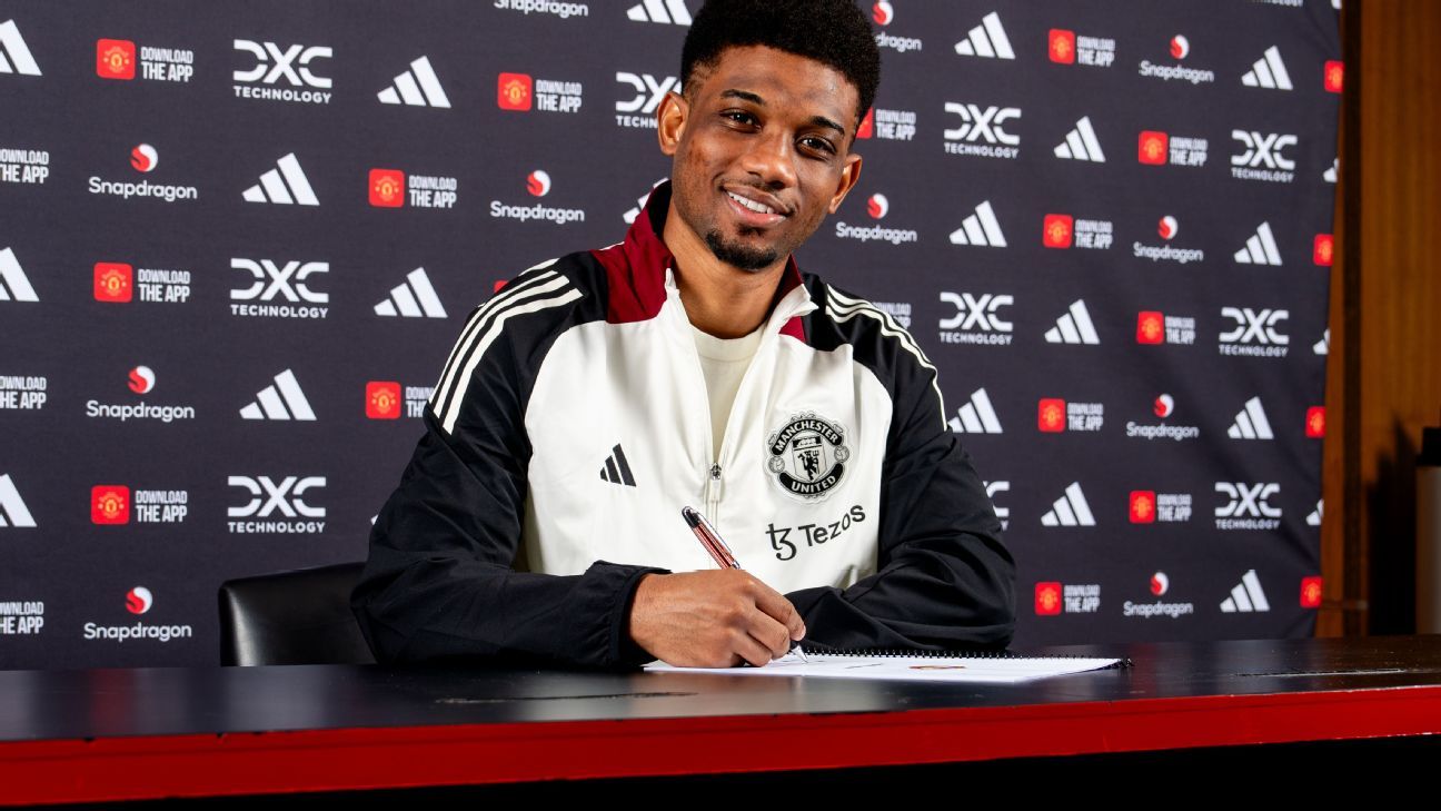
Home: The main body of this jersey has a gradient effect that goes from a bright, tomato red at the neck through to a deeper shade at the hem. The visual effect is meant to replicate the shirts worn by the "Busby Babes" side of the 1950s, whose synthetic rayon jerseys were said to shimmer under the Old Trafford floodlights. We can only assume the original shirts didn't also have the logo of the club's official "digital transformation partners" affixed to the sleeves.
Away: No, this is not the new uniform of England's one-day international cricket team, despite appearances. United have gone back to the 1990, when they regularly turned out in blue away kits. The 2024-25 version is officially listed as "indigo" and has an "M" monogram woven into the material as well as a wavy collar detail that represents the three main waterways that flow through the industrial heart of Manchester.
1. Newcastle United (Adidas)
Home: Adidas supplied Newcastle's kits for 15 years from the mid-1990s to 2010. For its return this season it has furnished the club with a revamp of one of the classics from that era -- the 2002-03 home kit, with its broad stripes and large, dual-tone V-neck collar. After a sequence of duds in recent years, it's good to see the Magpies looking sharp again.
Third: The nostalgia angle is worked even harder here, with Newcastle unveiling a updated design of their popular white, green and black away kit from 1999-2000. There are extra retro points for the 1970s club crest. Like the shade of green chosen for it, this kit is mint!
 (1).png)
 5 months ago
6


